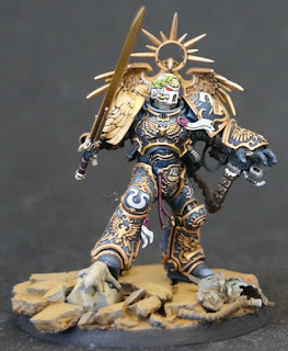
*Edited took new photos using Greg's suggestion to manually focus.
I did a little test fit of Guilliman's head and sword and tried to take some nicer photos. I was unable to get my camera to focus, so these were the best I could get. At the least, you can see the general outline of the model and where he is going. For those of my friends following along the painting process, I figured some photos were better than none. There are still lots of unfinished parts on him, including gems, purity seals, groin bead thing, and gold highlighting. After all of that I can finally start adding environmental effects. The big take away for me is that there is too little focus on his chest/head area. Maybe I'll use transparent smoke colored paint to add depth to the shadows. I'm still on the fence about that, as I don't have any of it on hand.


The focus issues were probably from all the filigree o_O
ReplyDeleteYou made him look epic though. He feels like a primarch.
I actually wondered about that. I'm a little worried that my camera might be shot.
DeleteI was feeling like it had more to do with the fact that all of the purity seals had pure white tails. If the helmet were the ONLY pure white on the mini it should draw more attention to itself.
DeleteThe sword really turned out gorgeous.
ReplyDeleteThank you, I appreciate that. Now I have to do all the gold filigree on him to the same standard.
DeleteComing together nicely...
ReplyDeleteSweeeeeeeet. The sword tone is fantastic against the rest of the model, well played man! Really glad you're going with the helmet, may have missed it but are you doing the unhelmed head as well?
ReplyDeleteYes, I'm going to paint the face as well. It looks a little weird though. We'll see which looks best.
DeleteI feel like the power fist fingers should be white or close to white. and then the sword hilt brighter as well to create a three points of a triangle - helmet, fist and sword hilt.
ReplyDeleteI think you are right. The hilt is not highlighted at all yet, so that is an easy fix. The power fist will take a little work, but that is doable. Great suggestion.
DeleteGlad to see the sword in place, it does look wonderful.
ReplyDeleteI still like the dark blue on the armour, it makes everything stand out a lot more.
He looks really imposing and well painted .... for a smurf
ReplyDeleteLooking Good John. Can you override the camera and use manual focus? (in case the ring gears are going?).
ReplyDeleteI'll give it a shot.
DeleteJust gave it a shot Greg. The photos are better. I should have used a light box though to avoid the harsh light coming in from the window! Great suggestion.
Delete